Formelio


We partnered with Formelio, a brand new healthcare software company based in the Netherlands. I made a distinctly identical style for them. Which reflects what Formelio stands for: Be Young & Innovative, Collaboration, Trustworthy & Honest, a bit Rebellious. My purpose was to find the unique visual style for the brand.
The main goal of the company is to improve the interaction between patients and doctors and improve people's lives. I had the idea that Formelio is like the construction of the Aqueduct. It serves as a bridge as well as a water conductor.
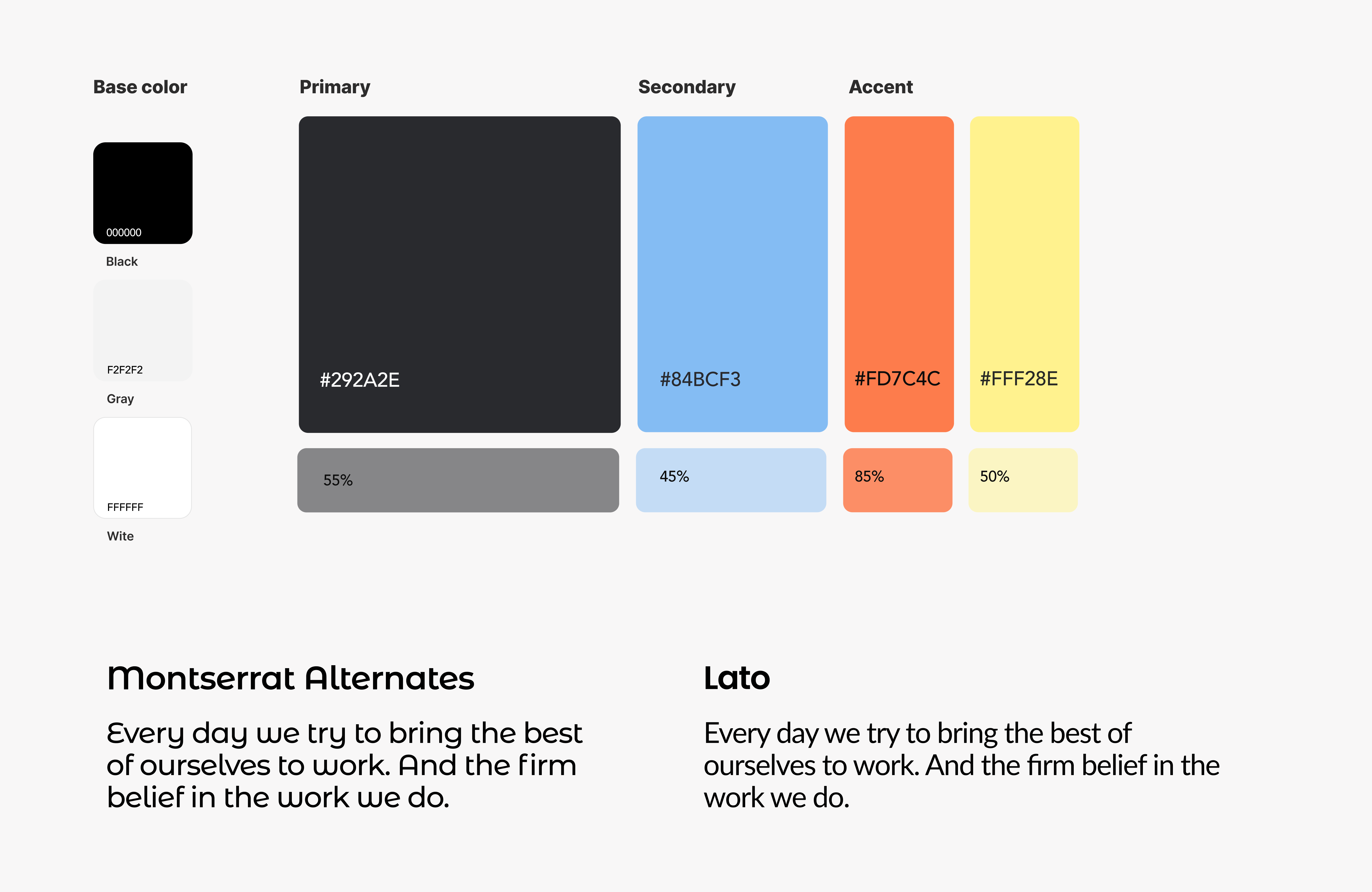
The logo conveys this idea. It consists of the name of the company where M serves as water, and the dash as a bridge.The color scheme where blue is the main color gives a feeling of energy and youth. Font pair Montserrat and Lotto bring a feeling of a bit rebellious mood.


